
Chapter 24. Seam JSF controls - JBoss Seam 1.2.1 正式版英文参考手册
Seam includes a number of JSF controls that are useful for working with Seam. These are intended to complement the built-in JSF controls, and controls from other third-party libraries. We recommend the Ajax4JSF and ADF faces (now Trinidad) tag libraries for use with Seam. We do not recommend the use of the Tomahawk tag library.
To use these controls, define the "s" namespace in your page as follows (facelets only):
<html xmlns="http://www.w3.org/1999/xhtml"
      xmlns:s="http://jboss.com/products/seam/taglib">
The ui example demonstrates the use of a number of these tags.
Table 24.1. Seam JSF Control Reference
<s:validate> | Description A non-visual control, validates a JSF input field against the bound property using Hibernate Validator. Attributes None. Usage
<h:inputText id="userName" required="true" value="#{customer.userName}">
  <s:validate />
</h:inputText>
<h:message for="userName" styleClass="error" /> |
<s:validateAll> | Description A non-visual control, validates all child JSF input fields against their bound properties using Hibernate Validator. Attributes None. Usage
<s:validateAll>
  <div class="entry">
    <h:outputLabel for="username">Username:</h:outputLabel>
    <h:inputText id="username" value="#{user.username}" required="true"/>
    <h:message for="username" styleClass="error" />
  </div>
  <div class="entry">
    <h:outputLabel for="password">Password:</h:outputLabel>
    <h:inputSecret id="password" value="#{user.password}" required="true"/>
    <h:message for="password" styleClass="error" />
  </div>
  <div class="entry">
    <h:outputLabel for="verify">Verify Password:</h:outputLabel>
    <h:inputSecret id="verify" value="#{register.verify}" required="true"/>
    <h:message for="verify" styleClass="error" />
  </div>
</s:validateAll> |
<s:formattedText> | Description Outputs Seam Text, a rich text markup useful for blogs, wikis and other applications that might use rich text. See the Seam Text chapter for full usage. Attributes
Usage <s:formattedText value="#{blog.text}"/>
Example 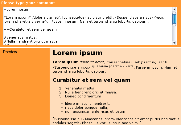 |
<s:convertDateTime> | Description Perform date or time conversions in the Seam timezone. Attributes None. Usage |
<s:convertEnum> | Description Assigns an enum converter to the current component. This is primarily useful for radio button and dropdown controls. Attributes None. Usage |
<s:convertEntity> | Description Assigns an entity converter to the current component. This is primarily useful for radio button and dropdown controls. The converter works with any entity which has an @Id annotation - either simple or composite. If your Managed Persistence Context isn't called entityManager, then you need to set it in components.xml: Attributes None. Configuration
  <component name="org.jboss.seam.ui.entityConverter">
      <property name="entityManager">#{em}</property>
  </component>
Usage <h:selectOneMenu value="#{person.continent}" required="true">
<s:selectItems value="#{continents.resultList}" var="continent" label="#{continent.name}" noSelectionLabel="Please Select..."/>
<s:convertEntity />
</h:selectOneMenu> |
<s:enumItem> | Description Creates a SelectItem from an enum value. Attributes
Usage
|
<s:selectItems> | Description Creates a List<SelectItem> from a List, Set, DataModel or Array. Attributes
Usage
<h:selectOneMenu value="#{person.age}"  converter="#{converters.ageConverter}">
    <s:selectItems value="#{ages}" var="age" label="#{age}" />
</h:selectOneMenu>
|
<s:graphicImage> | Description An extended <h:graphicImage> that allows the image to be created in a Seam Component; further transforms can be applied to the image. Facelets only. All attributes for <h:graphicImage> are supported, as well as: Attributes
Transformations To apply a transform to the image, you would nest a tag specifying the transform to apply. Seam currently supports these transforms:
It's easy to create your own transform - create a UIComponent which implements org.jboss.seam.ui.graphicImage.ImageTransform. Inside the applyTransform()method use image.getBufferedImage() to get the original image and image.setBufferedImage() to set your transformed image. Transforms are applied in the order specified in the view. Usage
|
<s:decorate> | Description "Decorate" a JSF input field when validation fails or when required="true" is set. Attributes None. Usage
|
<s:layoutForm> | Description A layout component for producing a "standard" form layout. Each child component will be treated as a row, and if the child is a <s:decorate>, additional formatting will be applied:
Attributes None. Usage
<s:layoutForm>
<f:facet name="aroundInvalidField">
<s:span styleClass="error"/>
</f:facet>
<f:facet name="afterInvalidField">
<s:message />
</f:facet>
<f:facet name="beforeRequiredLabel">
<s:span>∗</s:span>
</f:facet>
<f:facet name="aroundLabel">
<s:span style="text-align:right;" />
</f:facet>
<f:facet name="aroundInvalidLabel">
<s:span style="text-align:right;" styleClass="error" />
</f:facet>
<s:decorate>
<f:facet name="label">
<h:outputText value="Name" />
</f:facet>
<h:inputText value="#{person.name}" required="true"/>
<f:facet name="belowField">
<h:outputText styleClass="help"
value="Enter your name as it appears
on your passport" />
</f:facet>
</s:decorate>
</s:layoutForm>
 |
<s:message> | Description "Decorate" a JSF input field with the validation error message. Attributes None. Usage
|
<s:span> | Description Render a HTML <span>. Attributes None. Usage
|
<s:div> | Description Render a HTML <div>. Attributes None. Usage
|
<s:fragment> | Description A non-rendering component useful for enabling/disabling rendering of it's children. Attributes None. Usage
|
<s:cache> | Description Cache the rendered page fragment using JBoss Cache. Note that <s:cache> actually uses the instance of JBoss Cache managed by the built-in pojoCache component. Attributes
Usage
|
<s:link> | Description A link that supports invocation of an action with control over conversation propagation. Does not submit the form. Attributes
Usage
|
<s:button> | Description A button that supports invocation of an action with control over conversation propagation. Does not submit the form. Attributes
Usage
|
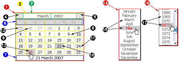
<s:selectDate> | Description Displays a dynamic date picker component that selects a date for the specified input field. The body of the selectDate element should contain HTML elements, such as text or an image, that prompt the user to click to display the date picker. The date picker must be styled using CSS. An example CSS file can be found in the Seam booking demo as date.css, or can be generated using seam-gen. The CSS styles used to control the appearance of the date picker are also described below. Attributes
Usage
  <div class="row">
    <h:outputLabel for="dob">Date of birth<em>*</em></h:outputLabel>
    <h:inputText id="dob" value="#{user.dob}" required="true">
      <s:convertDateTime pattern="MM/dd/yyyy"/>
    </h:inputText>
    <s:selectDate for="dob" startYear="1910" endYear="2007"><img src="img/datepicker.png"/></s:selectDate>
    <div class="validationError"><h:message for="dob"/></div>
  </div>
Example 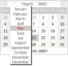 CSS Styling The following list describes the CSS class names that are used to control the style of the selectDate control.
 |
<s:conversationPropagation> | Description Customize the conversation propagation for a command link or button (or similar JSF control). Facelets only. Attributes
Usage
|
<s:conversationId> | Description Add the conversation id to an output link (or similar JSF control). Facelets only. Attributes None. Usage
|
<s:taskId> | Description Add the task id to an output link (or similar JSF control), when the task is available via #{task}. Facelets only. Attributes None. Usage
|
<s:fileUpload> | Description Renders a file upload control. This control must be used within a form with an encoding type of multipart/form-data, i.e:
<h:form enctype="multipart/form-data">
For multipart requests, the Seam Multipart servlet filter must also be configured in web.xml:
  <filter>
    <filter-name>Seam Filter</filter-name>
    <filter-class>org.jboss.seam.web.SeamFilter</filter-class>
  </filter>

  <filter-mapping>
    <filter-name>Seam Filter</filter-name>
    <url-pattern>/*</url-pattern>
  </filter-mapping>
Configuration The following configuration options for multipart requests may be configured in components.xml:
Here's an example:
  <component class="org.jboss.seam.web.MultipartFilter">
      <property name="createTempFiles">true</property>
      <property name="maxRequestSize">1000000</property>
  </component>
Attributes
Usage
|